

Imagine your entire financial universe—revenues, profits, assets, and liabilities—all coming to life in one stunning, interactive dashboard. No more buried spreadsheets. No more waiting for reports. Just real-time financial clarity at your fingertips.
In this blog, we reveal a next-gen Financial Dashboard built in Power BI—a visual masterpiece designed to turn cold numbers into warm insights.
Profit & Loss – Where Numbers Talk Business
Your income statement just got a makeover. The Profit & Loss page of this dashboard isn’t just a report—it’s a visual conversation about your business’s heartbeat.
What makes it powerful?
Total Revenue & Expenses: Big, bold KPIs with YoY variance and sparkline trends. Instantly spot growth or red flags.
Net Profit Surge: See the financial win with sharp profit trends and eye-popping 1,000%+ YoY growth metrics.
Profit Margin: Visualize efficiency, not just earnings. Are you earning smarter? This chart answers that.
Monthly Trends Column Chart: All twelve months, side-by-side. Spot seasonality. Identify spikes. Decode success.
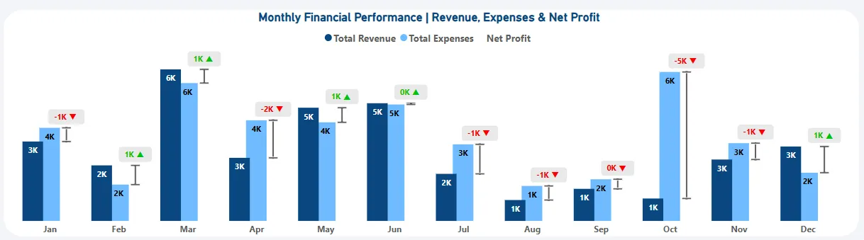
Takeaway: This page tells you what’s working and what’s draining your finances—all with a swipe, scroll, or click.
Balance Sheet – The Business Backbone, Visualized
Your balance sheet but make it beautiful.
The Balance Sheet brings your assets and liabilities into perfect visual harmony.
Why it stands out:
Total Assets, Liabilities & Equity KPIs: Big figures. Bigger insights. YoY change color-coded for immediate comprehension.

Net Worth Tracker: See your company’s true value—updated in real-time.
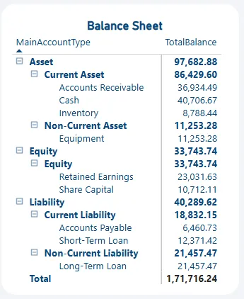
Balance sheet Table: Zoom in from the big picture to the tiniest transaction with expandable account categories.
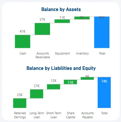
Waterfall Charts:
- Assets Breakdown: From cash to equipment, every dollar is accounted for.
- Liabilities vs Equity: See how your company is funded—equity-heavy or debt-reliant?
Takeaway: Turn static accounting statements into interactive strategy tools. It’s not just about what you have—it’s about what you’re doing with it.
Insights That Go Beyond the Books
Data is only useful when it drives action. This dashboard includes financial ratios and trend lines that transform insight into strategy.
What you’ll discover:
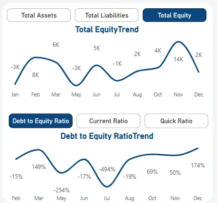
- Equity & Quick Ratio Trends: Are you liquid enough to survive a storm? The answer is in the trend.
- Debt to Equity & Current Ratio Visuals: Know your risk profile before the bank tells you.
- Year-Round Trendlines: Equity fluctuations? Liquidity shocks? The dashboard catches them before you do.
Takeaway: Financial stability isn’t just a number—it’s a story. These trends help you write a better ending.
Why Power BI Is the CFO’s Secret Weapon?
Gone are the days of flipping through outdated spreadsheets or static PDFs. Power BI gives your financial reports superpowers:
✨ Instant Insights
- Stop waiting for finance to “close the books.” Get real-time visibility, always.
- Click-to-Drill – Want to explore last quarter’s expenses? Just click and zoom in.
- Data-Driven Strategy – Align every decision with what the numbers are saying—live, visual, and accurate.
Final Thoughts: Turn Finance into a Force
This isn’t just a dashboard—it’s a financial cockpit, designed for CFOs, analysts, and decision-makers who want to fly their business smarter.
So whether you’re evaluating profits, hunting inefficiencies, or forecasting growth, this Power BI Financial Dashboard turns complexity into clarity.


